The Purpose Behind a Brand Redesign


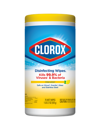
The Clorox® brand has designed a new, global logo for all its products worldwide. It’s been almost two decades since we last updated the logo in the U.S. and this is the first time we’ll have a global packaging architecture. This is just the latest step in our evolution to a purpose-led, human-centric brand.
Chris Hyder, vice president and general manager – Cleaning, and Elena Otero, vice president – International Marketing, got together for a conversation about what drove the change and how it will usher in a new era of global growth for the Clorox brand.
Look for the new logo on store shelves around the world now.
What prompts a brand to redesign its logo? Are there common triggers?
Chris Hyder: A couple years ago, we clarified our global brand purpose, which is: Clorox stands for a cleaner world where people thrive. When we clarified that brand purpose, we looked at all the ways we communicate with consumers. We felt our approach needed to change, to become more forward-looking and modern. The logo redesign is part of that.
Elena Otero: We first changed our advertising, and now it’s time to modernize our label and packaging design, to bring in the more emotional aspect of our brand purpose. Since we’re taking a more human-centered approach to the brand, we want to have consistency in our graphic elements.
Another objective for us was to have a consistent global design. In International, we have a single package design across countries, but it’s different from the U.S. Since we have a global brand purpose, we also want a package design that’s relevant everywhere.
Chris: That’s right. We want to make it easier for our consumer to recognize the brand and shop for the product she wants. We want information on the package to be driven by what people care about versus what might be category convention
For example, scent is very high on all our packaging today. We scream scent even on products where scent is not particularly important to our consumer. In some cases, scent will still be important, like our Clorox Scentiva® products. But in other cases, scent is actually No. 4 or 5 or 6 on the benefits people care about. And so it will be demoted, if you will, in favor of communicating more important benefits, like what the product is or that it kills germs. That’s a product-by-product thing.
You’ve mentioned making the packaging more human and showing our brand purpose. How does a logo help do that?
Chris: The logo’s changing in three ways.
First, it’s becoming more modern — the font and angles and shapes we use.
Second, we’re bringing in more elements of optimism to the design. Look at the yellow color, for example. The curvature of the yellow, the fact that it stands out, brings optimism to the logo.
And the third piece is we’re making it feel more approachable. It’s going from this overwhelming energy — strong blocky letters, strong triangles — to a design aesthetic that feels more personable.
Elena: When you see the old logo, it’s a little bit of a super hero approach: “Here I am! I’m going to solve all your problems!” Whereas the changes we’ve made communicate: “I’m your partner. I’m with you. We’re going to solve this together.” The changes are about bringing the brand back down to Earth. That’s what the new typography does, the use of that yellow and the glow on the background.
Chris: You put those three things together, and that pushes our equity forward to where we’re trying to take it. This logo is built in modernity and optimism; it’s all about looking forward to what’s enabled by clean versus our previous logo, which was really grounded in functional, powerful benefits.
Was there any concern people wouldn’t embrace a new logo?
Elena: This is not a change because the logo wasn’t working, so that makes changing it more challenging. But we believe it’s in the best interest of the brand to look and feel more modern. So we tested and tested and tested it with consumers globally — in the U.S., Chile and the Middle East. We’ve seen consistency in how people react to it.
Chris: When people change their logo or brand aesthetic and try to own a new set of benefits, they can make the error of leaving behind the benefits that were core to their equity. What our testing on this shows, and why we believe in it so much, is we are picking up new attributes we care about but with zero tradeoffs to things like power and trust and efficacy that Clorox has always historically owned as a brand.
This is a global logo now. Was that a difficult balance to get right? Are there important regional considerations when designing a logo?
Elena: I always believe consumers are more similar than different, and we didn’t see any geographic outliers. This is a very strong brand everywhere we have a presence. People love it, and international consumers truly believe in the power of bleach.
You’ve talked about this new logo unlocking the next phase of growth. How does it do that?
Chris: The logo itself doesn’t unlock the next phase of growth. Positioning the brand to be purpose-driven and human-centric, about what clean enables instead of about the process of clean — that’s what’s going to unlock future growth. The logo is just one expression along that path.